by ChrisD | Mar 13, 2016 | Art Supplies, Blog Posts, Chris's Blog, Color theory, Painting, Techniques
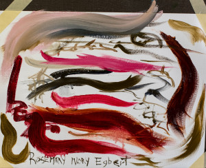
I would like to thank Rosemary Brush Company who has designed an outstanding brush with my name!
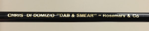
CHRIS DI DOMIZIO “DAB AND SMEAR”
The question is why this brush?
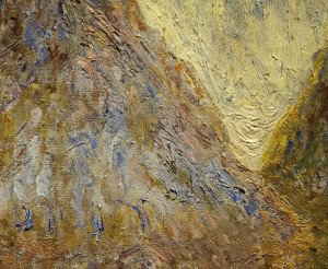
“DAB AND SMEAR” that’s why! The best way to soften an edge is to use a fan brush (see future blog on “Sargent and the Fan Brush”). The DI DOMIZIO “DAB AND SMEAR” brush is made specifically for an artist to leave the perfect amount of paint on medium/coarse linen. Too little paint does not allow blending and too much paint smears into each color into each other therefore destroying intensity and beauty of the color.
I first heard this art term while researching my favorite portrait artist…John S. Sargent and his academic studies in Paris. The term refers to a brush technique taught at Ecole des Beaux-Arts during that time in the nineteenth century.
This technique is when you place a “DAB” of paint placed next to another ”DAB” of paint while taking the brush to “SMEAR” the two edges of adjacent colors together. Hence the term “DAB AND SMEAR”.
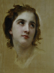
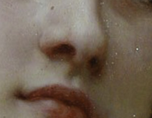
I remember a day I had enlarged an image by Willam Bouguereau and noticed the “DAB AND SMEAR” technique.
From a distance, His paintings have the appearance of over blended color.
But upon careful examination, I noticed the “DAB AND SMEAR” application from one of the leaders of the Ecole des Beau Arts. Read my next blog called “DAB AND SMEAR and Translucent Color” for more on this topic.
In today’s art, I believe the “DAB AND SMEAR” technique is best used for blending DABS of color also known as “broken color”.
 This“broken color technique” is great for impressionism, but how does the artist who is trying to paint realistically achieve the high degree of blending and yet the actual perception of color?
I believe it takes careful precision to get this effect. For example, what I believe creates beautiful flesh tones is to use broken color. The difficulty is maintaining the identity of the one local color while dabbing around it with many other colors yet without Dabbing additional colors there is no local flesh tone achieved. While knowing if you over blend you may lose the luminosity and richness of the color
 The new “DAB AND SMEAR” brush allows me to load the perfect amount of paint on my brush to keep the separation of colors and over blending from happening. Yet it allows me to blend for the representational art which is the direction I have always leaned toward ( though my wife has been nudging me toward a more contemporary painting techniques).
Its funny but I do not paint to be a famous artist. I paint to have a voice in the art community. I believe I have a calling to help people/artist step into their desire by equipping them with art tools for success.
This brush excels on Fredrick’s Oil Primed Linen Panels.
If the painting surface is too smooth than the bristle brush will not lay paint down. In that case, I love Rosemary Brush Co’s Eclipse brushes and her Sables.
Keep an eye out for the following blog on where broken color and DAB AND SMEAR started for me.

by ChrisD | Mar 13, 2016 | Art Supplies, Blog Posts, Chris's Blog, Painting
CHRIS DIDOMIZIO FAVORITE BRUSH LIST:
Brush Holder :
American Journey Brush Holder AJBHB A14003 $26.99
(Short handle is a typo on their part. This brush holder is the best holder for Rosemary Brushes Longer handles).
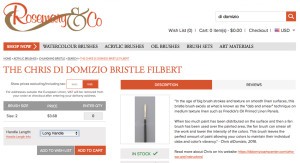
Rosemary Company is definitely my favorite brush company
It appeared to be the #1 used brush in the Portrait Society of America International Show in Atlanta 2015:
All of the brushes seem to have a tip at the end of the stroke, could be the taper, but there is a new vocabulary for me. a brush stroke use to be measured by its length but know it also is used by its physical depth sticking out from the page. all of this is achieved by still allowing me to be in control of the brush stroke. there is a sensitivity to the stroke and the power and length at the same time.
On all rosemary brushes I believe you have a choice between short handle for watercolor and long handle oil paint brushes.
I prefer the long handle.
* Rosemary Ivory Egbert size size # 0. drawing with a paint brush.
*The Signet robert Simmons Egbert bristle size # 2,4 brush strokes out of control
*Ivory Filberts size # 0,1,2,,3,4 on Arches Huile Oil Paper for plein air painting
*Rosemary Long Eclipse size #0,1,2,3,4, detail work, on smooth linen and paper
*Rosemary Pure Sable 81. Sizes.# 1,2,4 detail work, fine blending
*Robert Simmons Signet #42 filbert. Sizes #1,2,4. Bristle brush work horse used for everything!
*Rosemary DI DOMIZIO DAB AND SMEAR BRUSH My brush is the bestest Favorite bristle brush. For all paintings 16:x20” and smaller. Used on Fridricks Oil Primed Linen Panels.
*Silver Company Grand prix 1003 filbert bristle size #0 brush smaller paintings
*Silver Company Renaissance 7102 bright, red sable, size # 2 this smaller sable is for eyes if you do not have any Rosemary sable brushes
*Signet Bristle fan brush size # 3
Brush description:
Egbert Ivory:
My drawing in brush: A lot of the portrait painters I have watch demo will start with this brush to hope to leave brush strokes in the beginning of the painting than refine with other brushes while leaving these early brush strokes “ artsy” marks.
This brush has synthetic hair and excels with different mediums,my preference is Natural Pigments Oleo Gel. Loading this brush with a lot of medium is where it shines.
Strokes which show confidence and command, action and spontaneity.
1.Starting the painting with a gel product either Oleo Gel or Walnut Oil and thin paint You feel like you are John S. Sargent and drawing with a paint brush. The hair is long enough to draw with , like a piece of willow charcoal, very artsy feel,
2. With any size you can make incredibly longer marks than any brush i have used on the market, 6-8 inch strokes, the larger brushes will make a 12’ or longer mark.
I do not like the bristle version “Classic Egbert” and do not see a difference between Rosemary and Robert Simmons Signet “Egbert”. this loads so much paint and can leave a texture depth unachievable than any other brush, this is in brail for the blind.
I Need a little control. and they load more paint than I can handle, it may be just me. I do plan on practicing with it…
Rosemary Co “Ivory Filbert”
Plein Air laying in brush
It is so similar to the Princeton 6300Fb size 4 but:
Leaves a little longer brush length to fill in the canvas area just a little faster with the same amount of paint, brushes are so similar but …not, just a little longer stroke length. I use both brush companies, i believe it too leaves a hint of a brush mark behind at the tail end of the mark.
Rosemary Co “Eclipse Long Filbert”
Is a wonderful blending brush. Detail finishing.
Allows a longer stroke before losing its paint. other synthetics lose their paint sooner.
The Hairs seem to have a blend of firmness which at the tail end of the brush stroke it leaves a small hint of a very light “ bristle “ look, just barely but enough to give a visual language to the brush. I do not know what John .S Sargent used on his painting of Lady Agnew on her leaves but this brush reproduces these marks.
it is a blending brush and it leaves textures at the same time when wanted.
works for softening edges like hair
the key to the brush is the tail end of the stroke, it finishes the end of the stroke well, just a hint of texture if you want it
works well with walnut Oil Gel and thinking out, a true pleasure to use when you need a certain mark
Rosemary Co “Filbert SER 276”
i only use the smaller sizes, softer detail brush with a little different look than the sable line
Rosemary Co “Pure Red Sable SER 81”
For a sable brush there is nothing like this.
blends like no brush, leaving just enough paint to blend with a fan brush with out ruining the color from the fan brush. it blends so well i do not need the fan brush.
it also has that same ability to leave a brush stroke at the tail end oof the stroke. leaving a thiner level of texture. I do not know a portrait painter who does not use this sable brush. period.
enough spring but not too mush.
when the brush is stiff it pulls off paint or make too short a length of stroke. the way the ends of the hairs with the taper allows the soft finishing stroke giving me control to leave or not leave a mark it also has a hint of a point when i rotate the brush while I movie it.
Rosemary Company Kolinski Sable Brushes SER 66 sizes # 0,2. Detail brush highly small refining has a slight point on it.
by ChrisD | Sep 13, 2015 | Blog Posts, Chris's Blog, Drawing, Painting
It is time to recognize a couple of our art program’s high school art students awards of the past.
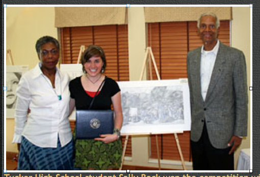
GREAT JOB SALLY BECK!!!!
Sally Beck WINNER of National Congressional Art Competition
Congressional Johnson applauds students efforts, awards college scholarships: Lithonia, Ga Rep. Hank Johnson (ga-04) announced the winners and warded four college scholarships.

Sally BeckHigh School Student – National Congressional Award Winner
Tucker high School student Sally Beck won the competition with ” Post Earthquake: A Day in Haiti.”
She traveled to Washington D.C. to have her art displayed in the Capital Tunnel.
Congratulations to Christina Bantz for her second place award in her regional district in the National Congressional Art Competition! After three years in our art school and spending her last year as my assistant teacher Christina has now gone to the University of Georgia.
Congratulations to Bella for her acceptance into Rhode Island School of Art and Design.
A longs time ago…. time to recognize this too,
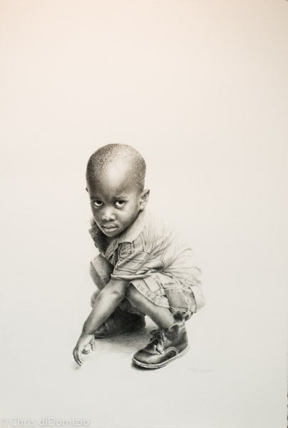
Congratulations to Megan Berner for her winning of the Governors Honors award Competition! Sorry, I do not have Megan’s high school image and Megan is now a college graduate, Nurse and Married-the name has changed to McCaul and has returned to art class. This is an amazing image of a child in Africa as Megan makes the next step into her professional art career. I truly believe Megan can be among the top artist in the country if that is her desire.
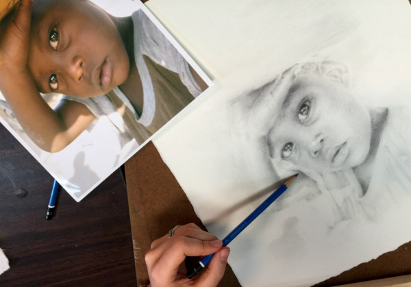
Megan McCaul’s drawing of a child from Africa
Julian Smith for second place award Bob Jones University High School National Art Competition

Julie Ann Smith
Julie Ann Smith Pastel drawing 2nd place Bob Jones University National High School Competition
It has been an honor to be a small part of these young adults art careers. They have persevered through the art course and each of the art lessons. They have shown amazing fortitude and desire. I wish I would have taken photographs of all the students and their art work of the past. I am proud of each and everyone of them who have joined our art community.
by ChrisD | Sep 7, 2015 | Blog Posts, Chris's Blog
Words Spoken Over Us
In the early nineties, after working for an art school, I was given an art class of four students in Atlanta. Margaret Hutchison, one of my first art students ever, was in this class. After the first or second day of art class Margaret said to me,
“I’m not sure I’m getting this, should I continue?”
Earlier that morning the director of the art program had notified me that if I lost any art students I would have to take a cut in pay. Even though it was my first day and I was taking over for a different art teacher, I was about to go from $45 for three hours to $30 and Margaret Hutchison who had never had art before said that sentence.. “I’m not sure I’m getting this, should I continue?”
I’m hoping I said YES to her because I believed she could succeed… Margaret is truly a wonderful person and artist, as demonstrated by her art work

Margert Hutchison Oil
I once had an art teacher in college tell me “to stick with photography you are a better photographer than artist”.
I’m so glad I did not listen to her, but it wasn’t until late 2014, almost 30 years later, that I realized I had believed those words spoken over me, that I was a better photographer than an artist. But one day, while working in Adobe Lightroom, using the photographic tools to convey my message, I realized I was thinking like an artist. I was making decisions using photographic tools used by an artist to convey an artistic message. And it was my message.
At that moment I realized that I AM an Artist first and photographer second.
Sometimes we have words spoken over us that somehow continue to falsely guide our lives, keeping us from stepping into our destiny. I believe art is about equipping the artist with the tools to communicate a message, your unique message.
What comes against our desire to do art?
margaret hutchison pastel
Just for argument sake: When your art work starts to get difficult, or a little confusing, I wonder if you hear those feelings or thoughts from the past?
Voices from the past, that you cannot do this… I wonder if not someone else’s voice over us but maybe our own voice? Voices from the past sometimes defeat us.
Plein Air painting is great example of how frustration and discouragement can come against us. Too often, within the first 30 minutes of being outside painting, I am ready to quit but as I have realized to just keep working through the painting and the difficulties disappear and I start to enjoy the day outside painting.
Is it possible that others do or have had these things said to them?

Margeret Hutchison
I formed logic from the undeveloped brain of a 5-year-old (frontal lobe of logic is not fully developed until the mid-twenties) from things that happened and were said to me. I am so loved by my folks and they were so easy to please.
They loved everything I did. My mom had a Christmas wreath I made in second grade where I glued elbow macaroni and spray painted it gold.
But I said to myself, “ If you like what I just did, wait till you see the next thing that I do” and that 5 -year-old started this “measuring up-perfectionism” without anyone knowing what was going on in that undeveloped brain.
About six years ago before I started to oil paint again (see my story in my Blog “How To Enjoy The Day Painting”) Margeret returned to the art school and I had shared with her that I realized what John S. Sargent may have done in his oil paintings and I could explain it through the artist story. After explaining this I asked Margaret to draw this image from Haiti for our Haiti fund raiser through y wife’s 501c3 called Art With a Mission Atlanta (AWAM ATLANTA) because I always loved this image and I would help her and explain the steps. Margeret is the only one I trusted to draw this image, yet it is interesting that I gave my best image to someone else to do. Was I was too afraid to do it myself?
In my mind I was not good enough?

Margeret Hutchison Graphite
So I asked a student to do it for me, for the children in Haiti.
Margaret is an amazing woman, a wonderful artist, and one of the most talented artists I have ever had the privilege to teach. What if someone did not stand in for Margaret and believe in her?
What is the sentence that you might say or hear? Where did a belief start? Isn’t it time to step out of that shadow and step into your desires through art?
…Or speak life into someone else who cannot speak it into his own life?
Margeret Hutchison Graphite
I wish I had more of Margeret’s beautiful art work to show the world, she was in the art class before I realized as an art school the need to advertise, our art program has always had between 150 and 200 students and it has been by word of mouth.
Is it time for you to step into your desirer and maybe to speak into someone else’s desire?
thank you, Chris diDomizio
p.s. interesting that I asked her to draw it and that I had held in reservation the opportunity to paint this image.
by ChrisD | Sep 6, 2015 | Blog Posts, Chris's Blog
I saw something about myself when I told the art class that I was going to do a painting after a twenty year break. I was stepping out and it was time to return to portrait painting. After gathering my thoughts and sketches and setting up the three cameras to film this video for our online art classes, I began!
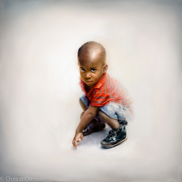
My wife has a 501c3 nonprofit called Art With a Mission Atlanta which aids students from an orphanage in Haiti to go to college. The artist in our Art School help raise funds to support this project. The image I am using is a little boy named Kiki. He has known so much heartache in his young life.
When I started this painting I did not understand why I was attracted to this image, but I was. With over 300,000 Mission’s Photographs from all over the world I chose this one. I knew I wanted to connect to the viewer through his eyes. His apprehension is obvious, yet somewhere inside of him is a desire to ask for help. His arm is closing us out. He would have to make the first step; hence the title “Step of Faith” by Chris di Domizio
As I teach the artist in our painting classes, start the painting where you wanted the viewer to connect with first, in this case it is the eyes. Then I chose the places for the viewer to look based on KiKi’s story, not wanting any texture from brush strokes which would add confusion to the viewer and to remove all confusion around him meant to remove all the texture. The surrounding white background represented God’s presence of purity and incense bathing him, regardless of his actions and the actions of others against him.
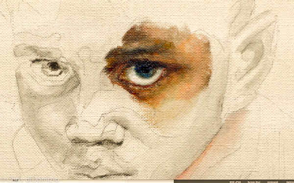
Close Up of Step Of Faith by Chris diDomizio, please forgive the flesh tone colors from an unedited video clip
Wanting this stillness to evoke a connection between “ just us”.
Having the eyes become the most important place in the painting without the use of two very powerful visual tools (color and contrast). Most of the teaching in our art program from the drawing classes and the painting classes almost solely focus on Color and Contrast and now I was about to leave them out of most important part of my first painting back in twenty years. I choose to leave out the color in the eyes because the color could have changed the message from hardship to something else. On the other hand I knew my job of getting you to look at the eyes would be easier with the addition of color to the eyes by adding visual weight to that area.
The next choice I was given was adding a highlight to the eyes. This is an easy way to bring attention to this area by adding contrast but it also can add different psychological aspects to an eye. I once heard that a high light to the eyes could give the person hope and alertness. My message was that life has been hard and there has been hurt in this little person’s life afraid tom have hope. So the two most powerful art tools I could use were off the table. The art tools our entire art school is built on and at the most important place of the painting. But I also teach that these “art tools” are not rules just tools for the artist to choose when to use and not to use.
As I finished the eyes I started painting the forhead, but this part of the face was to represent the harshness of his experiences. Keeping the “pretty” color of the flesh tones to a minimum using the greyed colors to evoke this message of harshness. Knowing I needed gray color, I subconsciously loaded my brush with bright orange – red flesh tones as bright as the scarlet red shirt.
There I was in front of three cameras and I needed grey and I grabbed bright orange – red, Boom! Mistake. It took minutes to remove the scarlet red and make it gray.
Starting again I reloaded because I needed gray for the message and Boom, I loaded bright red.
Like Smeagol and Gollum in Lord of the Rings, with a multiple personality, I verbally said to myself “what are you doing? I answered… I don’t know. What do you mean you don’t know…

You know to make the painting about contrast and not color and that putting the grey first will keep the color calmed down. I answered… I know” and at that moment I realized that my precious ego is more important than my message.
As this battle in my mind continued I realized that I had to put the color first to make the forehead come forward, but the painting was about contrast and not color and then I said to myself ”it’s more important to show off what I can do and make it realistic than to communicate a message.”
 The entire first day all I did was worry about the camera watching every stroke. Portrait painters will know when you get the color off or mess up on the drawing and Gollum had a field day with.
Welcome back painting! Are we having fun yet?
The next day I realized what had happened. I was so worried what others were going to think that I lost my painting’s message of connecting. As I started to paint on day two, but this time it was about connecting my message, one stroke at a time. I had a great day.
Ironically, on the first day of painting for the instructional video I rarely spoke, all the talking in my head was to Gollum. Imagine a portrait training video with no words! (I will voice over the mistakes and have commentary like a tennis match, with the good and bad strokes, and why)
The second day I had a great day explaining the purpose of each stroke, and that each stroke went in with the right color, temperature, intensity, and texture. Everything I was trained to do was going into the painting.
I’d like to say day three was a good one but unfortunately it was a silent film and all the chatter and arguing was with Gollum. Imagine an instructional video without instruction!
Day four was a great day, explaining the purpose and execution of a message! Here is what I have learned:
The days I paint for just me, connecting my message with my plan, placing each stroke with a place and a purpose, that’s the day I enjoy painting.
Chris diDomizio the return to painting twenty years later. Painting is fun and I enjoy the process of learning about myself with each stroke.
The title “Step of faith” was for me, it was up to me to “step into my calling in art” to trust in Him who has equipped me to be an artist. To be the Artist that I am today, not the artist I will one day become. I’m just to work on who I am today, One Step of Faith at a Time”.